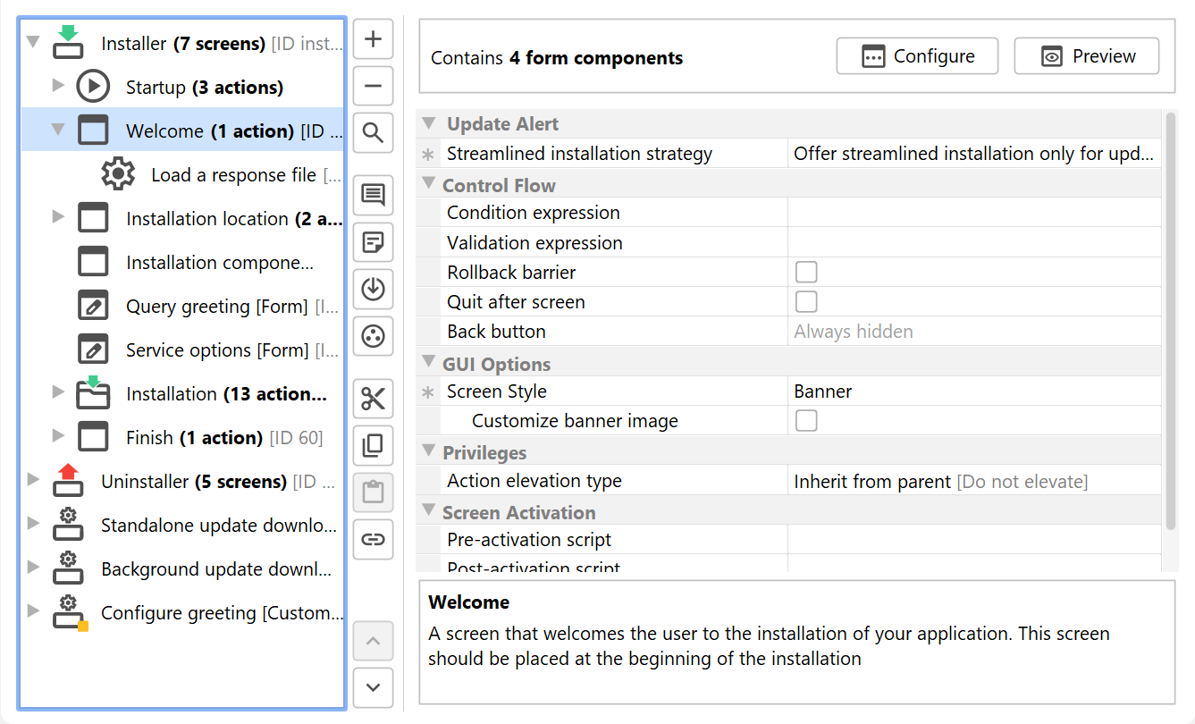
Screens are configured on the Installer->Screens & Actions step. A screen is a single step in an installer application. It displays information to the user or gathers user input.
If a screen has attached actions, there will be an expansion control to the left of the screen icon that allows you to show the associated actions.
Some screens only make sense when corresponding actions are used later on in the installer or uninstaller. For example, the "Services" screen will only be displayed at runtime if there are "Install a service" actions present on a subsequent screen. If such a dependency is not fulfilled after adding a screen, a corresponding notification is displayed.
Properties of screens
Common properties of screens are:
-
Action elevation type [Privileges]
If any contained actions should run in the elevated helper process, if their "Action elevation type" property is set to "Inherit from parent".An elevated helper process is available on Windows and macOS if the process has been started without admin privileges and the "Request privileges" action has been configured to require full privileges. -
Screen Style [GUI Options]
The default screen style for this installer application. Screens and screen groups can override this style. -
Condition expression [Control Flow]
This expression is evaluated to decide whether the screen is displayed. If the expression or script returns false, the current screen will be skipped. This expression or script should not have any side-effects, it will be called while another screen is still being displayed. -
Rollback barrier [Control Flow]
If the screen should be a rollback barrier. When a rollback barrier is completed, none of the preceding actions will be rolled back. You can use this property to prevent an incomplete rollback of complex changes or to protect actions from rollback when the user hits "Cancel" in the post-install phase. -
Exit code [Control Flow]
If the "Rollback barrier" property is selected, and a rollback terminates at this screen, this property determines the exit code of the installer. By default, reaching a rollback barrier during a rollback is considered a success, but you can signal a failure by specifying a non-zero exit code here.This property is only visible if "Rollback barrier" is selected.
-
Validation expression [Control Flow]
This expression or script is called when the user clicks the next button. If it returns false, the current screen will be displayed again. You can use this to validate user input. Error messages are not displayed automatically, you can use the Util.showErrorMessage(String errorMessage) method in your script. -
Quit after screen [Control Flow]
If the screen should have a "Finish" button instead of a "Next" button. The installer or uninstaller will quit after this screen. The "Cancel" button will not be visible if this option is checked. -
Back button [Control Flow]
Allowing the user to go back to previous screens can be problematic if the previous screen has actions attached that cannot be executed multiple times. By default, every action is just executed once, all actions have a property to allow multiple execution. The default behavior is the "Safe back button", where the back button is hidden if the previous screen has actions attached that cannot be executed multiple times. -
Wizard index [Screen Activation]
Every screen can set or change the current wizard index. The wizard index is an optional panel on the left side of the wizard that shows overall installation progress. You can leave the index unchanged as it was set by a previous screen, change the step in the current wizard index, removed the current wizard index ot configure a new wizard index. For conditional construction of a wizard index, please use the com.install4j.api.context.WizardIndex class in the "Pre-activation" script. -
Step key
The key for the step in the wizard index that should be activated.This property is only visible if "Wizard index" is set to "Activate another step".
-
Steps
The steps that are displayed by the wizard index. Each step has a key that you can use to switch to that step later on by setting the wizard index property to "Activate another step" and specifying that key.This property is only visible if "Wizard index" is set to "Set a new wizard index".
-
Initial key
The key of the step in the wizard index that should be initially selected. Leave empty to select the first step.This property is only visible if "Wizard index" is set to "Set a new wizard index".
-
Partially defined
If selected, the list of wizard index steps will be partially defined. This means that a "..." entry will be appended at the bottom.This property is only visible if "Wizard index" is set to "Set a new wizard index".
-
Numbered
If selected, the steps in the wizard index are numbered.This property is only visible if "Wizard index" is set to "Set a new wizard index".
-
Maximum width
The maximum width of the wizard index in pixels. The preferred with is determined by the longest step name, the maximum width is an upper bound for the actual width.This property is only visible if "Wizard index" is set to "Set a new wizard index".
-
Minimum width
The minimum width of the wizard index in pixels. The preferred with is determined by the longest step name, the minimum width is a lower bound for the actual width.This property is only visible if "Wizard index" is set to "Set a new wizard index".
-
Background color
The background color for the index panel. Set to "None" to restore the default color.This property is only visible if "Wizard index" is set to "Set a new wizard index".
-
Foreground color
The foreground color for the index panel. Set to "None" to restore the default color.This property is only visible if "Wizard index" is set to "Set a new wizard index".
-
Background image
The image file for the background of the wizard index panel. Leave empty if no background image is required.This property is only visible if "Wizard index" is set to "Set a new wizard index".
-
Image anchor
The anchor for the background image. The default value is "North". -
Pre-activation script [Screen Activation]
This script is called each time just before the screen is displayed. -
Post-activation script [Screen Activation]
This script is called each time just after the screen has been displayed. It is not invoked in console or unattended mode.
Available screens
The following standard screens are available in install4j:
Empty form
Category: Form templates
Banner with header at the top
Directory selection
Display PDF file
Display progress
Display text
Program group selection
Category: Standard screens
Welcome
Display license agreement
Installation scope
Based on the user selection, the attached "Request privileges" and "Set installation directory" actions request the necessary privileges and adjust the installation directory.
By default, this screen is not shown if the current process already has the rights to install for all users or if the current installation is an update installation.
Installation location
Installation type
The "Installation components" screen may be hidden by this screen, depending on the installation type selected by the user. This screen will not be shown if no installation components are defined.
You can choose for each installation type if it should be customizable or not. If the installation type that is selected by the user is customizable, the "Installation components" screen will be shown if present, otherwise that screen will be skipped. This condition can also be checked by inspecting the boolean value of the installer variable sys.preventComponentCustomization.
Installation components
Create program group
File associations
Additional confirmations
Installation
Display information
Finish
Uninstall Welcome
Uninstallation
Uninstallation failure
Uninstallation success

